As a professional graphic designer I can honestly say one of the most fun parts of my job is creating packaging. It’s truly a fascinating process, creating a two-dimensional design that will ultimately become a three-dimensional object. But while I find it to be a fun and exciting challenge, it can also be a very intimidating and almost daunting task if you don’t know the basics of what’s needed in order to create and properly set up a piece of packaging for print. If not set up properly, not only will your printer hate your guts and form all sorts of creative and explicit oaths about graphic designers in general, but your client (or boss) won’t be thrilled with your talents (or lack of) either. So to help you along, I’m setting up this basic demonstration on how to resize an existing piece of packaging. I’m showing you how to resize instead of create from scratch because I think you’ll get the point in this example on how to do both… plus, if you’re just starting out in design, it’s much more likely that you’ll be working with a previously designed file. If the former designer set it up properly, it should be pretty easy for you to follow along. If the previous designer did not set up the file properly (which could explain why you’re working on the packaging instead of them), then take notes. It make take you a bit more time to set the file up in a manner that’s easy to make changes and updates later as well as have the cleanest possible file, but it’ll be worth it in the end (both for you, your client/boss, and your foul-mouthed printer).
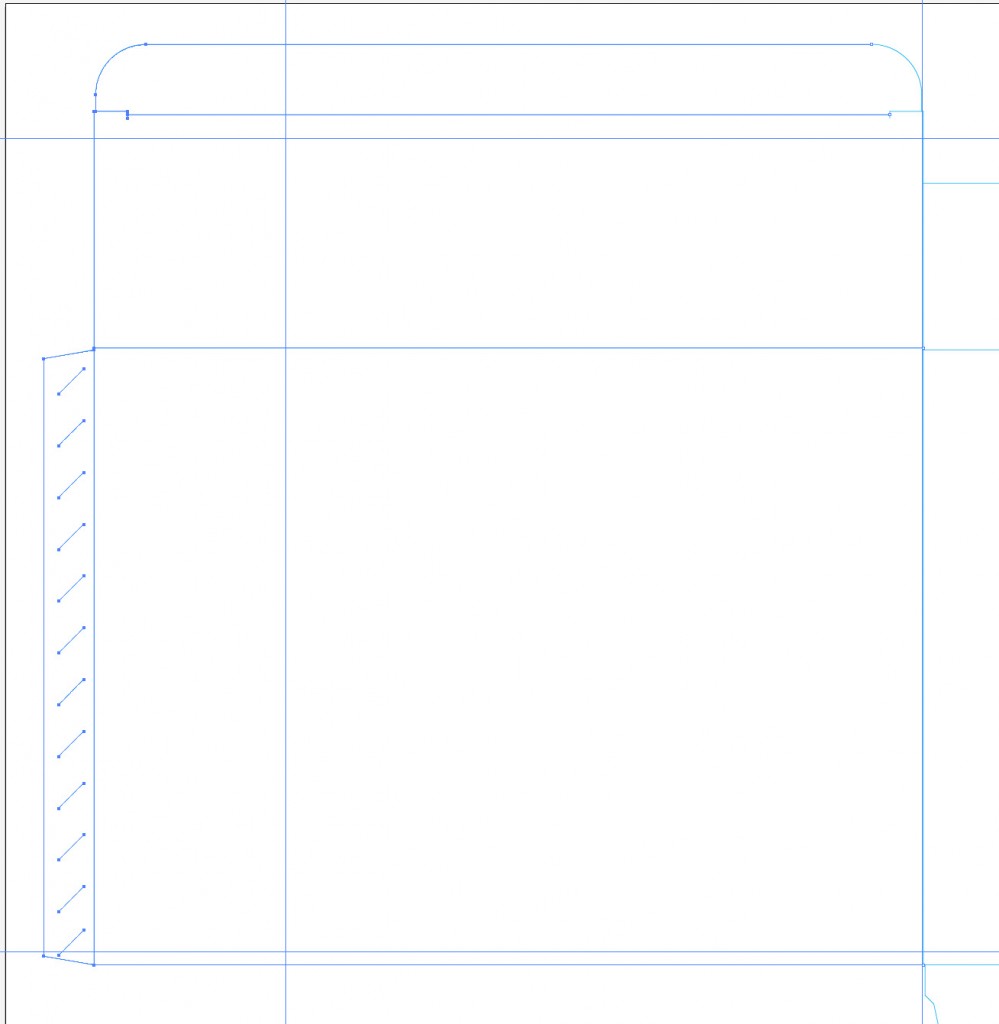
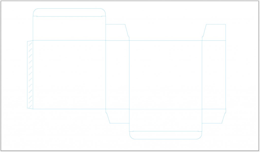
First off, let’s go over some basics. Any (and every) type of packaging must start with a dieline. What’s a dieline, you ask? You should have learned this in at least one of your graphic design classes at school, but if you’re self-taught or need a refresher, then I’ll give you a brief explanation: A dieline is basically a outline of the flat shape of your package. Sounds simple enough, but you’ll need to set up the dieline in a specific manner so it doesn’t print on the actual package and the printer has the ability to strip it and separate it from the file itself without hurting the integrity of the design. To “strip” in printing terms means separating a part of the file (in this case, a spot color) so the printer can process and create the die cut for the box. You see, all forms of printing, even in packaging, are printed on a square or rectangular piece of paper or cardboard, then later cut into the proper shape. That’s the die cut.
So now that you know some of the terminology, it’s time to get to work. For my example I’ll be using an actual file from an actual client. Meet RT Foods, Inc., makers and developers of TigerThai frozen foods. My assignment today is to take an existing box and resize it to new dimensions. They’ve decided to go with a smaller version of an existing product, so smaller packaging is required for a tighter fit and so more of that product can fit on the shelf (or in this case, the freezer). After they determined how much product they want to fit in the box, they supplied me with new dimensions: The box should be 185mm wide x 250mm high x 80mm deep. It’s VERY important to have accurate dimensions up front. Just guessing the proper size will only lead to wasted time and workflow in the future. I won’t even begin a package design until I know the proper dimensions, which should be supplied to you by the client or printer.
These new dimensions are not proportional from the original, so there will be no shortcuts with a massive “select all” and scale down. When it comes to packaging, you really should try to avoid that anyway. Doing such could mean fonts become too small to read, logos aren’t prominent enough and an overall unbalanced look for the size of the packaging. It’s always best to start with the dieline first, then reorganize content as needed to keep the quality and integrity of the product, while maintaining proper hierarchy.
FILE SETUP: UTILIZE THE PROPER PROGRAMS FOR THEIR PROPER FUNCTIONS
Now that we know our dimensions it’s time to edit our dieline, and I’m going to explain a few things here in regards to programs you should be using. So, because of their versatility and standard use in the industry of graphic design, I use the Adobe Suite, version CS5. You get a lot of programs with this suite, so utilize them! Vector objects should be made in Illustrator, raster object and photos should be edited in Photoshop and ALL layout should be done in InDesign. There’s nothing I hate more than getting a file from a designer who simply did everything in Illustrator or (someone please kill me now) Photoshop. If you have these three programs, you should be using all three, and for the reasons they were created. Take the time to use all of these programs for what they were intended, and you’ll find life is a lot easier.
On that note, your dieline could be created in InDesign, but you should use Illustrator for this piece. Why? First off, you have a wider array of tools that will make the development of the dieline much easier in the long run, plus you can save the file and simply import it into your InDesign document as a single graphic image, assuring that no lines are mistakingly moved or edited. You can lock it down on it’s own layer and never worry about it again. As with all Adobe programs, there are twenty different ways to do anything, but this is a widely accepted and used method, so that’s where I’m going first. Off to Illustrator to adjust my existing dieline to the new dimensions.
Upon opening my existing dieline it’s important to note that I already have it set up for overprinting stroke and spot color. These things are less for you and more for your ever pissed-off printer to keep him or her happy and prevent them from calling you later to bitch about the problems with your file. So before you even begin to resize your dieline, check these two things:
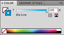
 Select your entire dieline and set the stroke color to 100% cyan. In your swatch library create a new swatch, and by double-clicking that swatch, change the color from process to spot, then rename the swatch “Die Line”. This little step will convert your dieline so it has it’s own printing plate and allows the printer to pull it out of the file and use it for processing the eventual die cut. I’m using 100% cyan as an example, and you could actually use any color in the spectrum so long as it’s set as a spot color, but the general acceptance is to use either 100% cyan or 100% magenta.Those two colors stand out from just about any design and will give you a good view of where those lines are on any file. They’re industry standard, and printers keep an eye out for them.
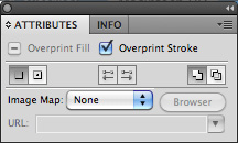
 With your entire dieline still selected, open up your Attributes panel. I have it as a part of my standard toolset in Illustrator, but you can access it through the “Window” file menu by selecting “Attributes.” When that’s open, activate the checkmark next to “Overprint Stroke.” What this does is it tells the selected strokes to print over any other color it may sit on top of, instead of knocking out the colors beneath it (creating a white line), and then printing on top of the white for a true color.
Let me see if I can explain a bit better. When you have a bunch of colors, objects, etc. on a page and overlapping each other (for example, let’s say blue type on top of a dark red background), your printable file will automatically adjust at press to separate the red from the blue and print them separately, so all of the red prints on white paper and all of the blue prints straight on white paper. It may look like the blue sits on top of the red, but truly it doesn’t. That part of the red background has been “knocked out” so the ink colors don’t blend – they print true color.
By setting your dieline stroke to overprint, you’re essentially telling the file you create NOT to knock out anything underneath that stroke. This is very important, because when you set up your file and have your dieline sitting on top of your package design, your printer will be separating that dieline from the rest of the file later on. So what would happen if you didn’t overprint the stroke and the printer removes the dieline? You’d have a white line knocking out of your design. You don’t want that. So overprint your stroke, and you’re safe for yet another day.
Now that we know our lines are the right color and set to overprint, it’s finally time to resize. This is the easiest part of the entire process. Starting from the middle and moving outward, just place guides and resize each panel to the new dimensions. If you can’t visually understand which panel goes with which dimension, simply print out a small version, cut it out and put it together. That should give you a better idea of what belongs where. In my first few years doing package design, I had mini-models spread out everywhere, so don’t be ashamed if you can’t visualize it right away.
Once you’ve resized all of your panels (don’t forget those pesky tabs), your dieline is finished and you can save it (give it a new name outlining the new dimensions for future reference and easy selection among your million other dielines).
Now it’s time to go back to our InDesign file where all of the elements of our package are put together, and get everything to fit within the new box areas.
When I set up any file in InDesign that requires a dieline, I prefer to keep the dieline on its own layer, set the preview settings to the highest quality so I can see the fine line of the die and not a thick, low-res rendering (allows for better precision on panel edges) and then lock the layer. All of my text and graphics go on a layer underneath the dieline, so I can see exactly where my elements need to go at all times, and it’s just a matter of turning off the visibility of the dieline layer to check and make sure there are no gaps or hairlines at the edges of my design elements underneath it.
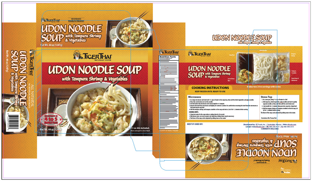
On the image below, you’ll see my new dieline has been imported and centered on top of my old box. You’ll notice the new dieline areas are quite a bit smaller than the old box, but it’s all workable. We just need to resize most of the elements (making sure the most important elements are still readable and the less important elements are reduced further in size) and rearrange them to fit within the new areas.
In the case of my client and having worked with them for some time, I know the TigerThai logo must remain prominent on all panels and the name of the product is imperative to remain large and readable at a distance. The image of the product on the front is very important, but can be reduced drastically in size on the side panels since it’s notably less-important to see them on the sides and we need to make room for the more important product name, “Udon Noodle Soup with Tempura Shrimp & Vegetables”.

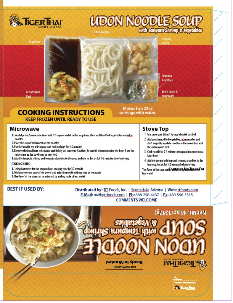
On the back, we need to make sure our cooking instructions are clearly readable, as they are the most important information on the back. That will require some resize of the product name and some major readjustments on the way the elements on the back panel are displayed. This portion will be the most challenging, but not impossible. The client expressed that they wanted the packaged soup image with callouts to remain somewhat prominent on the back, so after playing with it for a bit I was able to make enough room on the top edge to place the TigerThai logo and product name (keeping in mind they should be at least of equal proportion or making the product name a bit larger than the logo), and I was able to easily fit the product image and callouts on top of the red strip. Some adjustments to the cooking instructions allowed me to fit them nicely below the product image, and
voila! we have achieved a nice balance of elements. Had we just done a mass-resize and kept these elements in the same place as before, we would have had some serious readability problems. This is much better and the client will be happy that all of the most important items in this section are properly displayed. You’ll see here as well that I laid out the side panel at the bottom of the folding box and will use this as my template for the rest of the side panels that display the same elements.
As I go through and finish adjusting the rest of my panels, you’ll notice that I’ve left room outside of the dieline for some bleed. Don’t forget to do this – the last thing you want is the cutter at the printer to be off slightly and give you a stark white line at the edge of the box where there should have been color. As with any printable layout, I’ve also left room inside the edges of my dieline so none of my elements risk getting cut off. Text should always remain at least 1/8″ or more inside the edges of any layout.
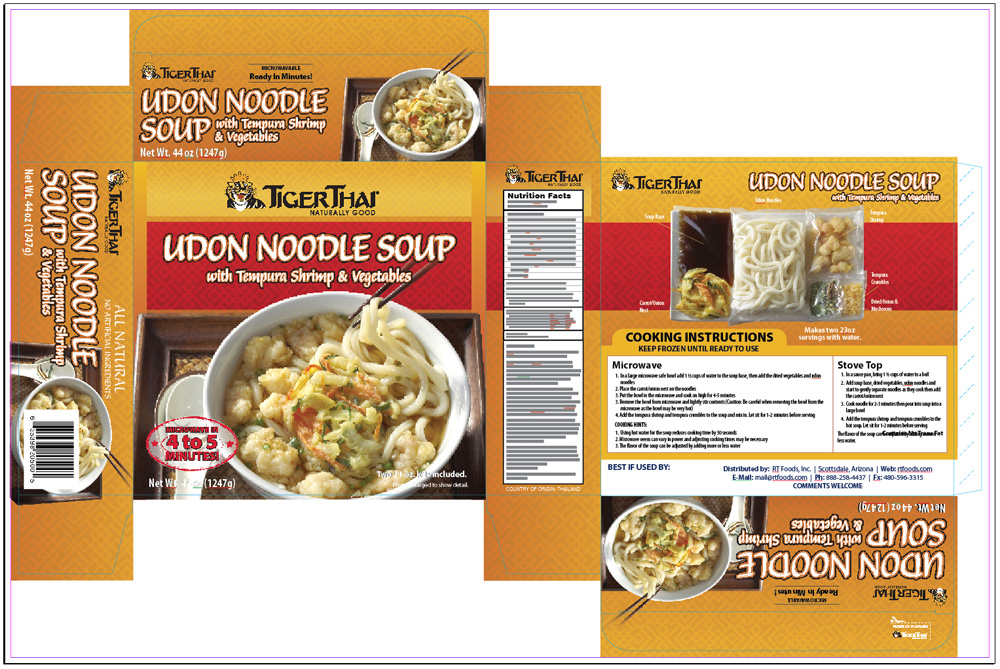
And as I mentioned before, I like to view my layout without the dieline once I get close to being finished. This allows me to zoom in and make sure I don’t have any mysterious gaps underneath that line which might show up as glaringly obvious on a folded edge of my finished box. I’ve got a nice textured image (created in Photoshop) that I use as a background on all of my panels, and I’m careful to make sure there’s some overlap on all of them. They dont have to come edge-to-edge and fit perfectly together, you’re allowed to overlap elements. That gives you the best chances of a nice, tight fit. And as you’ll see below, I have a clean, finished product.

You’ll see here that while I didn’t place a higher importance on the imagery on the panels, I was still able to keep them fairly large and consistent across the board. My nutrition panel is nicely centered, and don’t ever feel like you have to move an element or lose the integrity of your layout simply because of a barcode. You’ll see the barcode on this piece sits right on top of the noodle soup image. That’s okay, because first of all, it has to be there, and second, even though it’s there your imagination fills in the gaps. So will the consumer’s. They’ve seen enough packaging at the store that the image will still gain attention even though their mind his busy looking over the bar code. The rest of the box images will fill it in for them.
FINAL OUTPUT
I sent a PDF of this layout to the client (low-resolution of course) and they approved it, so now it’s time to set it up for press. The good news is that we’ve done most of the hard stuff already, but setting up are dieline correctly from the beginning. Now it’s just a matter of outputting the file as a press-ready PDF. Now, in most cases you’ll want to talk to your printer about how they like their files. Adobe Acrobat is a very widely accepted format and in most cases that’ll work with maybe some adjustment to settings, but sometimes they’ll ask for an outlined Illustrator file which is just as easy to export from InDesign. In our case, the printer is actually out of Thailand and although they can use Adobe Acrobat files, they have had problems in the past with outputting the type, so before I print as a PDF I’ll need to select all of my text in my InDesign document (command-A, making sure no layers are locked) and outline all the text in the file (command-shift-o). This assures that all of my text is treated as a vector graphic instead of embedded text. Not necessary for all printers, but a safe bet when you’re in doubt. This will increase your file size substantially, but we’re FTP’ing the file anyway, so not a big deal. It’s much more important to have an accurately printed file.
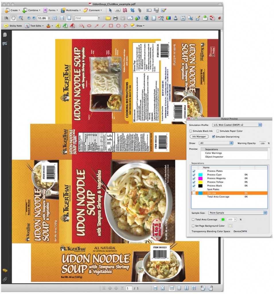
So after that’s done we output our PDF file from InDesign (File –> Adobe PDF Presets –> Press Quality) and once the dialog box pops up we need to check some important settings. The Press Quality general setting usually has everything set up that we need, but under “Output” we’ll need to select the Ink Manager and make sure we have any randome spot colors printing as CMYK except for our dieline. Since this is a 4-color job with die cut, the die cut should be on it’s own plate and separated out so the printer can pull it later. Once that’s fixed we can go ahead and output the file, and we can go into Acrobat and check the dieline. This is a good place to show you what overprinting does.

While your final file is open in Acrobat, click on your Output Preview (or sometimes called Separation Preview) tool. This tool is typically located under the Advanced menu, or you can make it a part of your standard Acrobat tool bar. Clicking this will open a dialog box where you can see your 4 separation colors (Cyan, Magenta, Yellow and Black) as well as any spot colors you have in your document. As you can see on the image here, I’ve clicked the checkmark next to my Die Line spot plate to turn it off, and you can see exactly how the file will be printed without the dieline. Had we not turned overprinting on in our dieline earlier, we would see a white line on our flat file where the blue dieline used to be. Easy as that, we’ve checked our file and we know it’s going to print successfully, our printer won’t hate our guts, the client won’t be paying any extra fees for changes later on (at least not due to us) and we get repeat work from all sides.
I hope this tutorial was helpful and please feel free to ask any questions that I may not have answered here!


